Six before seven
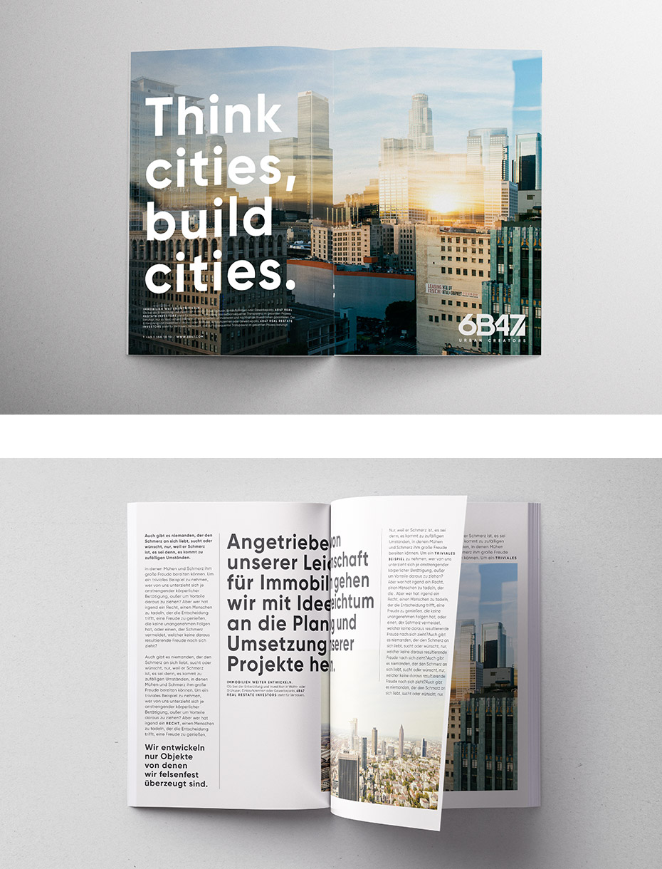
soft rebranding for 6B47, a real estate investor
logo, branding and corporate design

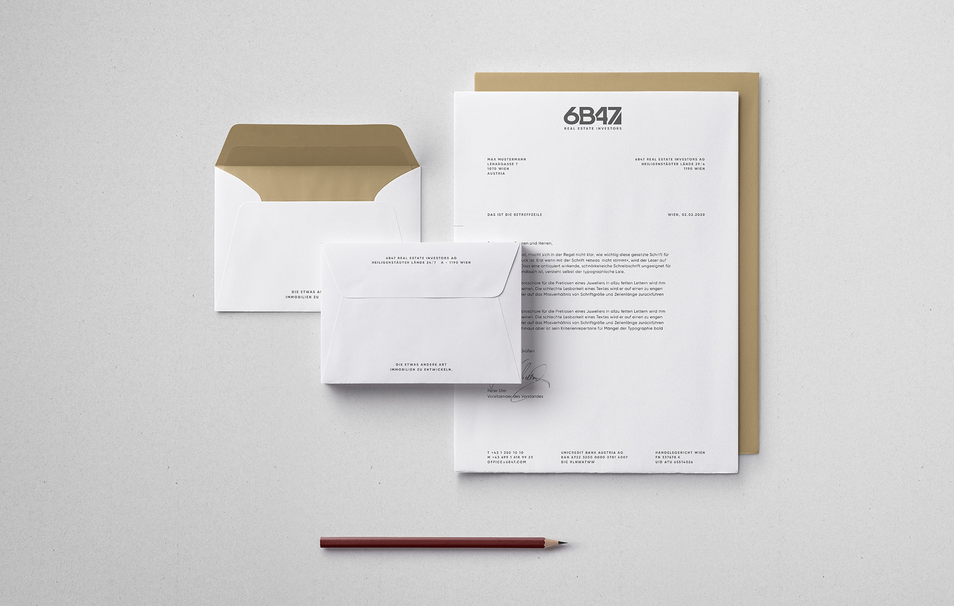
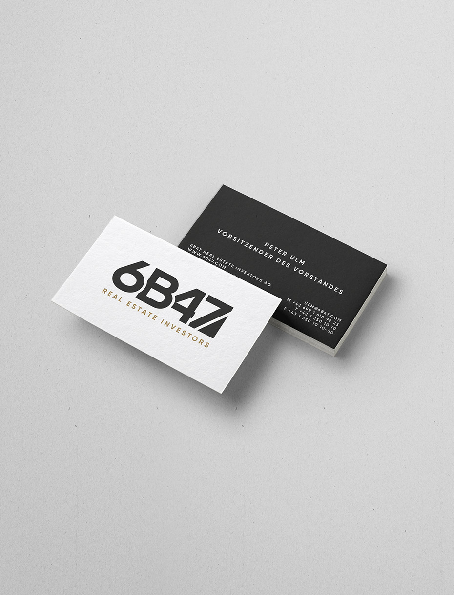
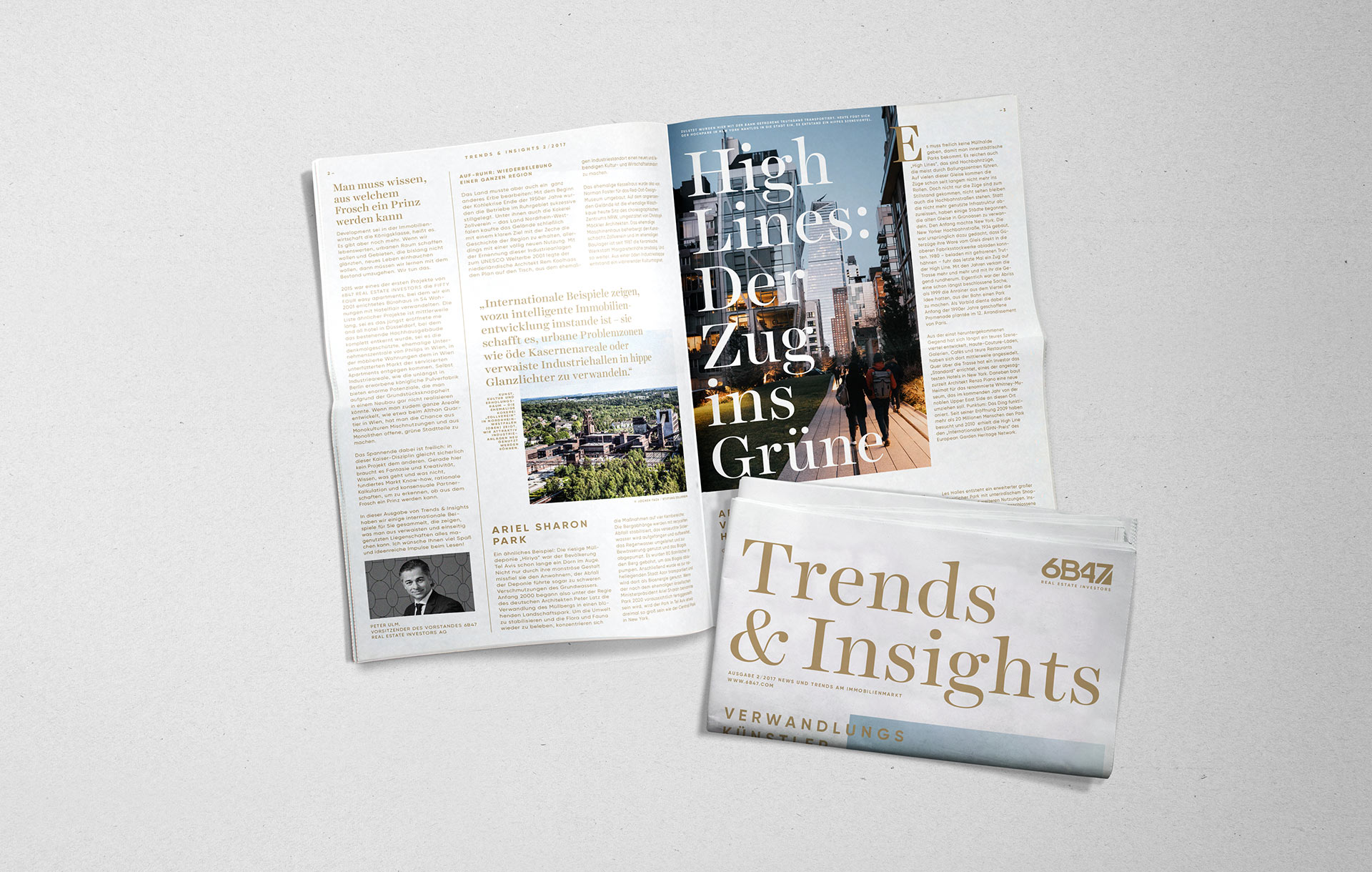
The clients wish was to keep the original logo but modernize the corporate identity which was dominated by a heavy dark red color scheme.
By emphasising a more sophisticated look the color gold was combined with a dark anthrazite, using dark red only for details such as pencils and other office materials. Still the logo was gently redesigned in order to improve readability.

credits
This design was developed during my
work at moodley brand identity, 2017
Client: 6B47 Real Estate Investors AG
Agency: moodley brand identity
Creative Direction: Volkmar Weiss
Graphic Design: Coco Breban
It’s never enough
Take me back to all projects
© 2019